You pull the stack of envelopes from the mailbox, the metal door squeaking against the dry autumn air. Sandwiched between a utility bill and a local grocery circular sits a thick, glossy piece of cardstock. The heavy ink catches the afternoon light, drawing your eyes immediately to a jagged, bright-red arrow tearing upward across a dark background. It is a campaign flyer, and it brings a quiet tension right to your front porch.
This piece of mail is designed to make your heart beat just a fraction faster. The stark typography warns of a sudden, terrifying spike in local break-ins, backing up the claim with an official-looking bar graph. The math feels entirely undeniable, sitting there in crisp print while you hold your keys and glance nervously down the street.
But numbers, much like shadows, change shape depending on where you place the light. What you are holding is not a direct reflection of your neighborhood’s safety, but a carefully cropped photograph of a much larger, more complex landscape. Incumbents and challengers alike rely on the fact that few people have the time or energy to interrogate a graph before tossing it into the recycling bin.
By manipulating the timeframe of the chart, campaign mailers routinely manufacture panic out of thin air. Once you see how the framing actually works, you can look at these glossy warnings without losing your peace of mind or feeling manipulated by election-season anxiety.
The Illusion of the Starting Line
Think of it like stepping onto a bathroom scale while holding a ten-pound weight, then stepping on the next day empty-handed and celebrating your sudden weight loss. The raw numbers are technically accurate, but the baseline is entirely fabricated. The scale isn’t lying, but the parameters of the test were rigged from the moment you stepped onto the glass.
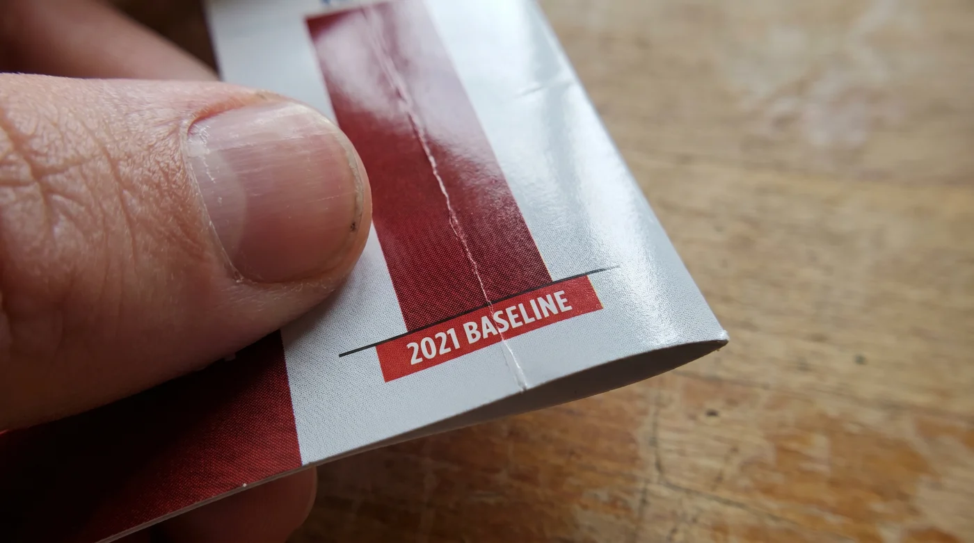
When you look at a crime statistic on a political flyer, the most important detail is rarely the height of the red bar. The secret is the starting date, printed in tiny, low-contrast font along the bottom axis. If you shift the baseline year to a period of unusual quiet, a normal return to baseline suddenly registers as a massive, frightening wave of danger.
Marcus Thorne, a 42-year-old municipal data archivist in Ohio, spends his mornings pulling raw public safety data into massive spreadsheets. Unbothered by the frantic pace of election cycles, Marcus treats numbers like geological sediment; they only make sense when you look at the deep layers over a long period. He often chuckles when campaign season ramps up, watching political operatives request specific, hyper-narrow data pulls. “They almost always ask for the numbers starting exactly in 2020,” Marcus notes. Because that specific year saw an artificial, lockdown-driven drop in street-level activity, comparing any subsequent year to that specific twelve-month window automatically generates a terrifying percentage increase. It is a mathematical sleight of hand, played out in hundreds of thousands of mailboxes across the country.
How Different Mailers Frame the Math
For the visual purist, the “Pandemic Trough” is the most common optical illusion currently circulating in local elections. By placing the starting axis at a historic anomaly, campaigns can draw a steep line upward to the present day. The context is deliberately erased, leaving you with the impression that your town has suddenly lost its grip on public order.
Then there is the “Percentage Trap,” often used in smaller municipalities or quiet suburbs. If your neighborhood historically sees one bicycle theft a year, and this year it sees two, a flyer can accurately claim a “100% surge in local property crime.” The percentage sounds like an epidemic, even though the physical reality is just one additional missing bicycle.
The “Hyper-Local Crop” is another favorite tactic for mailers targeting specific voting blocks. Instead of showing the data for the entire precinct or city, the data analyst draws a microscopic boundary around a specific three-block radius that had a bad month. They isolate the worst data, shrink the map, and present a localized anomaly as if it is a city-wide crisis threatening your specific doorstep.
Understanding these variations takes the sting out of the mailer. You begin to see the flyer not as a dire warning from a failing society, but as a deliberate marketing pitch constructed by a data team working late on a Tuesday night.
Finding the Five-Year Rolling Average
You do not need an advanced degree in statistics to dismantle the illusion on the glossy cardstock. You only need a slightly wider lens. By calculating the five-year rolling average, you smooth out the artificial spikes and troughs, revealing the actual heartbeat of your community’s safety.
Doing this requires only a few mindful actions and a willingness to look past the heavily saturated red ink. It takes just five minutes, but it completely alters how you consume political messaging for the rest of the season.
- Locate the “Source” citation usually printed vertically along the edge of the flyer (e.g., Local Police Department Open Data Portal).
- Visit that portal on your phone or laptop and search for the specific incident type mentioned on the mailer.
- Pull the total number of incidents for that category over the last five full calendar years.
- Add those five numbers together and divide by five to find your baseline average.
- Compare the current year’s projected total to that five-year average, completely ignoring the flyer’s chosen baseline year.
Your tactical toolkit here is wonderfully minimal: a browser window, a local municipal web address, and the basic calculator app on your phone. You are simply breathing through a pillow of raw data, muffling the loud, sharp noises designed to make you react purely on emotion.
Regaining Your Front-Porch Peace
When you learn to check the rolling average, the seasonal flood of campaign literature loses its grip on your nervous system. You stop viewing your neighborhood through the distorted lens of an election cycle and start seeing it for what it actually is—a living, breathing community with normal, fluctuating rhythms.
This verification hack is about much more than catching a mathematical technicality. It is about protecting your peace. By refusing to let manipulated baselines dictate your sense of safety, you reclaim the quiet comfort of your own front porch, long after the recycling bin has been emptied.
“Data without a wide enough timeline is just a story someone else is trying to force you to believe.” – Marcus Thorne, Municipal Data Archivist
| Mailer Tactic | The Mathematical Reality | Added Value for the Reader |
|---|---|---|
| The 2020 Baseline | Starts the graph during a historic low to simulate a massive upward spike. | Prevents you from panicking over a normal return to pre-lockdown baseline levels. |
| The Percentage Surge | Uses small raw numbers (1 to 2) to create terrifying percentages (100% increase). | Allows you to demand raw incident counts instead of falling for alarming ratios. |
| The Hyper-Local Crop | Isolates a tiny geographic area to misrepresent the broader community safety. | Helps you keep a realistic, city-wide perspective on your actual daily environment. |
Frequently Asked Questions
Is it illegal for campaigns to manipulate these dates?
No, as long as the numbers themselves are factually accurate for the dates provided, campaigns are legally allowed to crop the timeline however they see fit to support their narrative.Where is the easiest place to find the five-year rolling average?
Most local police departments have a public ‘Open Data’ dashboard on their official municipal website. Look for an ‘Annual Reports’ or ‘Crime Statistics’ tab.Why do both major parties seem to use this exact same tactic?
Because fear is a universally effective motivator for voter turnout. Regardless of the platform, an incumbent wants to show crime plummeting from a high baseline, while a challenger wants to show it spiking from a low one.What if my local portal doesn’t go back five years?
You can often utilize the FBI’s Crime Data Explorer online, which aggregates standardized local precinct data over much longer, verifiable timeframes.How should I talk to my neighbors who are panicked by these flyers?
Gently share the five-year average with them. Frame it not as a political argument, but as a reassuring fact that the neighborhood is actually much safer than the glossy cardstock implies.