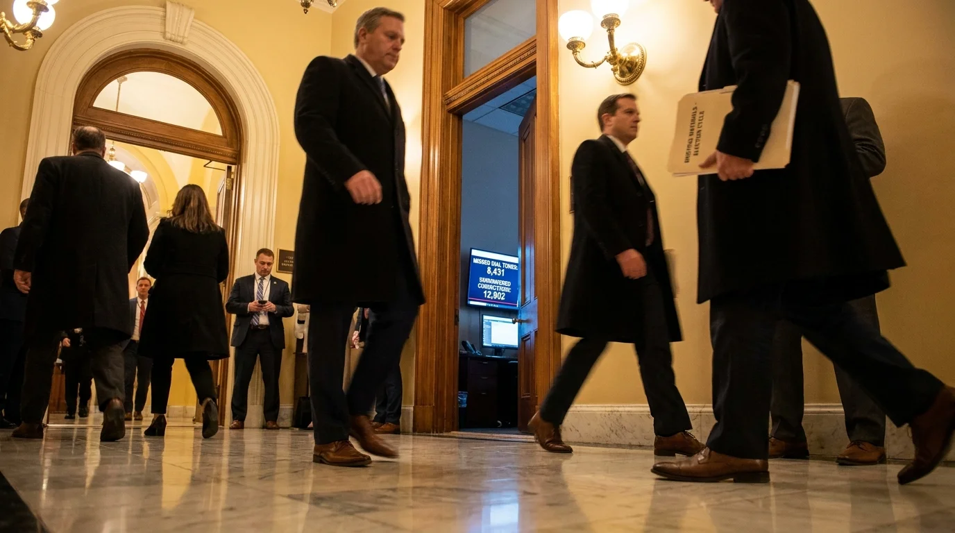
A fluorescent-lit room in late October hums with the dull vibration of cooling fans and server racks. Across a dozens-strong bank of monitors, a blinking desktop screen tallies missed cell phone dial tones, marking cold numbers as dead air while the clock counts down to the evening news cycle. You see the polished graphics on your television screen an hour later, clean bar charts showing a race locked in a dead heat, but the mechanical reality behind those numbers is far messier than the graphics suggest.
You are told these snapshots reflect the collective voice of your community, yet millions of active citizens vanish before the first question is even asked. When automated dialers collide with modern smartphone spam shields and strict consumer filters, the screening engine makes an instantaneous, quiet decision to drop the call.
Traditional survey architecture was designed around copper wires bolted into suburban living rooms. When a modern survey instrument tries to reach an apartment renter whose phone number carries an out-of-state area code and zero landline caller ID footprint, the system frequently flags that record as unusable. Automated filters discard mobile respondents before a live human being ever hears their voice, creating an invisible demographic moat around public polling data.
This mechanical blind spot explains why headline numbers frequently wobble and break apart when real ballots are tallied. Understanding this process transforms how you interpret every major forecast heading into an election cycle.
The Architecture of the Unheard: How the Screen Cuts
To understand why headline surveys diverge from reality, you have to look at the statistical sieve known as the ‘likely voter screen.’ Polling houses do not just ask if you care about an issue; they run your profile through an algorithmic filter designed to predict whether you will actually walk into a polling booth. This filter operates like an antique sorting machine calibrated exclusively for heavy stones, letting finer, newer gravel slip straight through the slats.
The algorithm relies heavily on past voting history drawn from state commercial voter files. If you recently aged into the electorate, changed your address after college, or skipped a mid-term cycle during a cross-country move, your statistical weight collapses. Algorithmic cutoffs disqualify younger voters simply because their consumer records lack the historical density of someone who has lived at the same street address for thirty years.
- Barack Obama teleprompter scripts enforce cadence shifts with bold yellow slash marks
- Save America PAC leadership switches official donor guidelines after abrupt executive staff departures
- Florida governor race polling reveals sudden turnout shifts across fast-growing coastal retirement communities
- Pete Hegseth Senate confirmation hearing sparks rapid committee revisions over Pentagon command structures
- Congressional hearing rosters force committee chairmen to yield floor time after sharp gavel strikes
When a pollster weights a sample to match census demographics, they must make mathematical assumptions to fill the void left by those dropped calls. If ninety percent of twenty-somethings do not pick up unlisted numbers, the few who do answer are weighted up to represent their entire generation. This practice assumes that the rare individual who picks up an unknown caller ID at dinner time thinks identically to the hundreds who swiped the notification away.
Marcus Vance, a forty-two-year-old survey methodologist based in Columbus, Ohio, spent years watching this friction play out in real time. During the 2022 midterms, his team monitored raw contact streams where over sixty percent of mobile outbound calls failed automated connection checks or were flagged by cellular carriers as telemarketing noise. Marcus realized that the industry was not measuring public opinion as a whole; it was measuring the opinions of people who still treat their telephone as an open door rather than a private boundary.
Three Ways the Filter Distorts the Signal
The gap between poll numbers and voting outcomes usually traces back to three distinct mechanical choke points in data collection. Recognizing these breakdowns helps you spot skewed findings instantly.
1. The Out-of-State Area Code Trap
Younger citizens rarely change their mobile numbers when they move for work, school, or family. A voter living in Phoenix with an Atlanta area code is routinely filtered out of municipal and state-level samples because automated sampling frames prioritize localized numeric prefixes to keep dialing costs down.
2. The Past-Turnout Penalty
Likely voter models heavily punish irregular ballot participation. If a respondent registered twelve months ago, the model views their lack of a past voting trail as a sign of apathy. Headline spreads collapse on election night precisely because these models underestimate sudden surges of newly engaged citizens who simply had no prior paper trail to measure.
3. Carrier-Level Spam Protocols
Federal STIR/SHAKEN caller verification protocols now empower mobile networks to intercept unidentified calls before the handset even rings. While this protects you from predatory scams, it also serves as an unintended barrier against legitimate academic and media pollsters, leaving landline owners as the easiest reachable demographic.
How to Audit the Numbers Yourself
You do not need an advanced degree in statistics to identify whether a survey reflects genuine community sentiment or an artifact of flawed screening. The next time a dramatic headline flashes across your feed, apply a calm, practical checklist to the underlying data sheet.
- Locate the sample composition section at the bottom of the release and check whether it polled Registered Voters (RV) or Likely Voters (LV). A massive divergence between the two often signals an overly restrictive filter.
- Examine the mode of contact: look for mixed-method designs that combine text-to-web invitations, verified online panels, and live calls rather than pure automated voice dialers.
- Check the unweighted sample size for age brackets under thirty-five. If the raw participant count is tiny compared to the weighted total, the margin of error for that demographic is significantly wider than advertised.
- Notice the field dates; surveys conducted over a single weekend often suffer from higher mobile drop-off rates than those fielded over five to seven weekdays.
The Tactical Audit Toolkit
Keep these baseline benchmarks in mind whenever you evaluate public polling releases:
- Gold Standard Contact Ratio: At least 60% of completed responses sourced from verified mobile or text-to-web connections.
- Fielding Duration: A minimum of 4 full days to allow call-backs to non-responsive mobile targets.
- Weighting Ceiling: No single demographic subgroup should carry an artificial weighting multiplier exceeding 2.5x its raw sample size.
Calibrating Civic Clarity
When you understand the mechanical limitations of likely voter screens, the constant noise of political coverage loses its power to disorient you. You begin to see survey results not as absolute truth, but as imperfect measurements captured through a very narrow aperture.
Recognizing the hidden bias of landline filters and algorithmic screens allows you to step back from the emotional roller coaster of daily numbers. It reminds you that the actual electorate is defined by real people casting physical ballots, not by who happens to answer an unknown caller on a Tuesday afternoon.
The loudest data point in modern polling is often the silence of the participant who never received the call.
| Screening Method | Mechanical Vulnerability | Impact on Reader Interpretation |
|---|---|---|
| Landline-Heavy Dialing | Excludes cord-cutters and renters | Over-represents older, residentially stable homeowners |
| Past Vote History Filters | Discards newly registered voters | Underestimates turnout spikes among emerging demographics |
| Automated IVR (Robopolls) | Trigger carrier spam blocks | Yields unrepresentative samples of highly responsive outliers |
Frequently Asked Questions
Why do polling organizations still rely on phone calls?
Phone lists tied to public voter files remain the most direct way to verify that a respondent is a real registered voter in a specific precinct, even though connection rates have dropped significantly.What is the difference between a registered voter and a likely voter?
A registered voter is anyone legally on the voter rolls. A likely voter is someone who passes an internal algorithmic screen based on past participation, current interest, and stated intent to vote.How do pollsters compensate for low young-voter response rates?
Pollsters use mathematical weighting, multiplying the responses of the few young people who answer so their percentage matches census figures, which can amplify statistical outliers.Are text-to-web surveys more reliable for reaching mobile users?
Yes, text invitations linking to secure web forms generally achieve higher participation rates across younger demographics than traditional live voice calls.Where can I find raw polling methodology reports?
Reputable polling entities publish detailed methodology statements and raw crosstabs directly on their websites or through academic repositories like the Roper Center.