A sharp March wind cuts across Pennsylvania Avenue, carrying the damp chill of the Potomac straight through your coat. In the muted grey light of 1913, long before color printing or digital billboards exist, the city smells of coal smoke, wet wool, and horse-drawn carriages. Most public gatherings are murky seas of dark bowler hats and charcoal overcoats, blending into the soot-stained limestone buildings behind them.
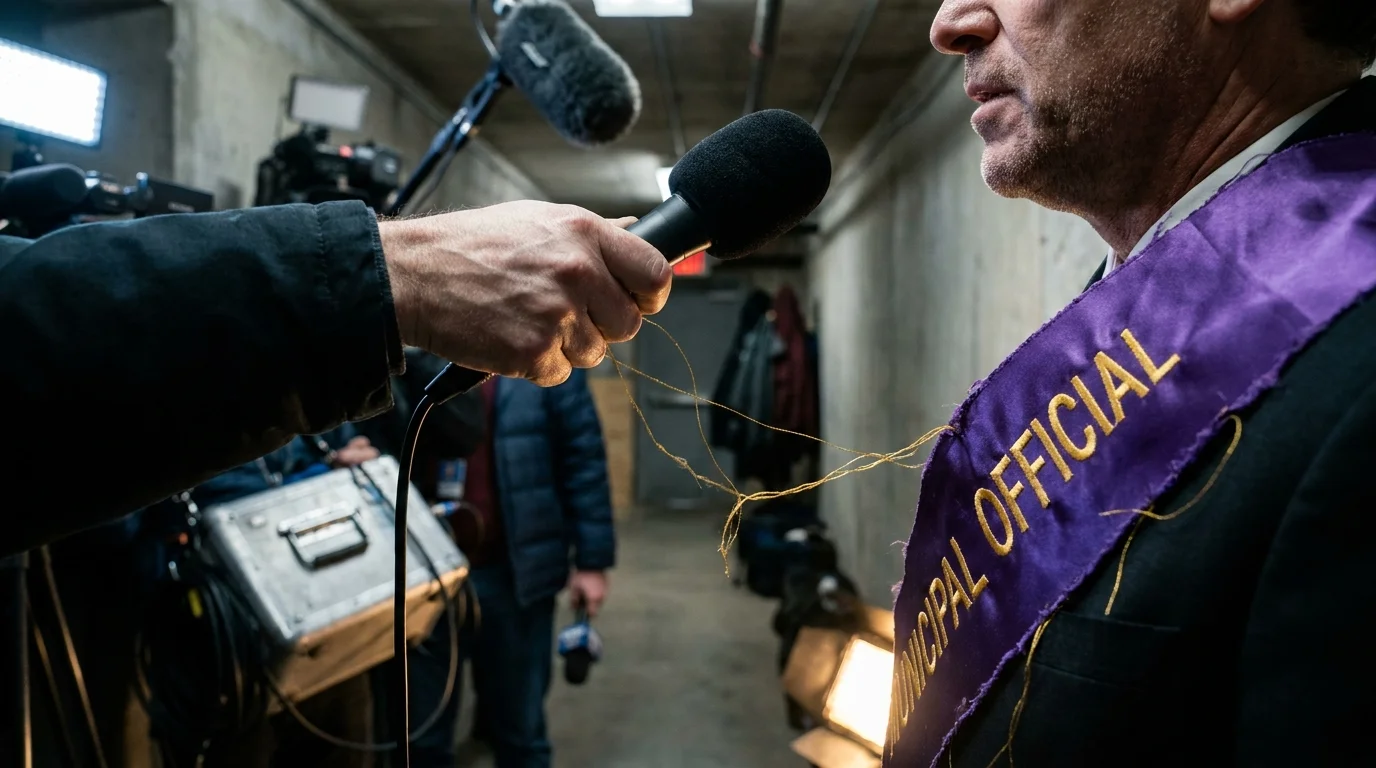
Then you spot the edge of the procession, and the visual noise of the capital completely snaps into focus. You see hand-stitched gold lettering frayed along the hem of a heavy purple satin sash, catching the pale winter sun with a deliberate, metallic glare. The people carrying these standards are not pleading for an audience; they are commanding the optical space of the street.
We are routinely told that visual branding and public messaging were invented by mid-century Madison Avenue executives in tailored suits. The real story is far more mechanical, gritty, and technically calculated. Long before corporate marketers drafted their first style guides, voting activists on the pavement had already reverse-engineered street optics, turning fabric stores into tactical labs.
What looked like simple pageant regalia to casual onlookers was actually a masterclass in optical contrast engineering designed to manipulate the primitive photojournalism technology of the early twentieth century.
The Chemistry of Black-and-White Visibility
To understand the genius behind these parade standards, you have to look through the lens of a 1910s Graflex press camera. The news photographers documenting street rallies were not working with balanced digital sensors or forgiving color film. They relied on orthochromatic glass plates, which had a glaring technical blind spot: they were hyper-sensitive to blue light, but completely blind to warm red spectrums.
If a protest banner used red fabric, the plate rendered it as a muddy, impenetrable black smudge. If an organizer selected sky blue, the chemical emulsion overexposed it into an empty, washed-out white, swallowing up any slogans painted across the surface. Standard printed signs disappeared into unreadable grey smears the moment a photoengraver etched them onto rough wood-pulp newsprint.
The activists solved this problem not through artistic impulse, but through cold, experimental optics. By pairing deep royal purple with brilliant white and sharp yellow-gold, they created a tri-color system that forced the photographic plate to do their bidding. The purple absorbed just enough light to register as a rich, velvety graphite, while the raw white linen bounced daylight cleanly into the lens.
- Highway trust fund gas taxes trigger hidden state fuel surcharges on weekly paychecks
- Precinct redistricting GIS software splits historic neighborhood school seats across arbitrary boundaries
- Municipal historic commission codes strip homeowner renovation rights behind closed advisory panels
- State paid family leave deductions strip weekly take home wages from crinkled paper paystubs
- Colonial Pipeline diesel allocation limits enforce sudden freight surcharges across greasy asphalt truck stops
The result was inescapable legibility: crisp, razor-sharp newspaper headlines that editors could not crop out, even when the accompanying editorial tried to dismiss the gathering entirely.
The Secret in the Basement Lab
In the winter of 1916, a twenty-six-year-old chemist and grassroots organizer named Hazel Hunkins spent nights in an unheated Washington basement, testing bolt after bolt of dyed fabric under bright incandescent bulbs. While mainstream politicians assumed parade colors were chosen for poetic symbolism, Hunkins approached the National Woman’s Party workroom like an industrial printing floor. She understood that a demonstration was only as effective as the slowest exposure time of a newspaper photographer’s shutter.
Hunkins worked with shears, chemical mordants, and measuring tapes, testing how silk twill hung against a blustery gust compared to heavy-gauge satin. A banner that folded over on itself in a 15-mile-per-hour crosswind was a tactical failure. By weighting the bottom hems with hidden lead dress-weights and securing the banners along rigid vertical dowels, her crew ensured that their written demands remained dead flat and readable even when mounted police tried to break the picket lines.
Strategic Fabric Formats for the Street
Every public action presents a different physical friction point against the urban environment. The women running these campaigns did not rely on a single uniform sign; they tailored their textiles to the specific physical geometry of the protest zone.
For the Marching Column
When you are moving five thousand people down a crowded thoroughfare, wind drag is your primary enemy. Organizers used high-luster satin with an open-weave backing, allowing heavy drafts to filter through without tearing the banner poles out of the marchers’ hands. The high-contrast gold thread was stitched onto the purple ground using a raised couching technique, making the letterforms three-dimensional so they cast tiny drop-shadows that stayed legible from three hundred yards back.
For the Silent Sentinel Picket
Standing motionless at the White House gates through freezing rain required a completely different structural build. For these static lines, activists deployed rigid muslin backed by oiled sailcloth to repel water, mounted on twin oak staves that rested in leather waist holsters. These standards were deliberately cut narrow and tall, occupying the exact vertical aspect ratio of newspaper front pages and preventing federal guards from walking past without appearing in the frame alongside the message.
For the High-Flash Night Scrum
When picketing pushed into the evening, press crews ignited magnesium powder trays that produced an explosive, blinding white burst. Glossy fabrics would cause severe halation, bouncing a harsh starburst of white light that obliterated painted letters on camera. For night pickets, organizers shifted to matte velvet and flat wool felt, swallowing explosive flash glare so that only the crisp, unyielding painted typography survived on the final negative.
Engineering Visual Clarity for Modern Spaces
You can apply these exact same mechanical principles to any modern message, whether you are staging a community demonstration, designing a storefront, or trying to cut through visual noise in an over-saturated public square. The goal is never sheer volume; it is mechanical clarity.
- Select your ground color based on the recording medium, not your personal aesthetic preferences. Test how your backdrop registers in high-contrast greyscale before finalizing a print run.
- Balance your letter weight so that strokes do not bleed together at a distance. If the negative space inside an ‘O’ or ‘E’ is narrower than the stroke itself, the letter turns into a solid dot fifty feet away.
- Anchor your bottom corners with discreet physical counterweights to prevent wind-curl from destroying readability during unpredictable outdoor weather.
- Prioritize split-complementary color pairings that maximize tonal separation rather than hue brightness. High tonal difference is what the human eye processes first.
Your tactical toolkit does not require heavy spending, but it demands strict discipline: keep your letter-to-background contrast ratio at a minimum of 4.5:1, use non-reflective matte substrates for outdoor daylight, and limit your primary slogan to seven words that can be parsed in under three seconds.
The Enduring Power of the Pavement Blueprint
When you look back at those early street demonstrations, it is easy to view them through the softening sepia haze of museum glass. You might see quaint pageantry, delicate sashes, and polite ladies standing on sidewalks. But strip away that nostalgic gloss, and you find a hardened, highly disciplined apparatus that understood mass communication better than the media institutions covering them.
They understood that the street is an arena of physical and technical friction. Your message does not travel on goodwill alone; it travels along the pathways of lenses, emulsions, printing plates, and visual contrast. When you understand how light, fabric, and human sight intersect on a cold morning, you stop hoping to be seen—you build an image that the world simply cannot look away from.
Real public persuasion does not begin when people agree with your words; it begins the exact moment your physical presence makes it impossible for them to look past you.
| Key Point | Detail | Added Value for the Reader |
|---|---|---|
| Orthochromatic Correction | Purple fabric was selected because early photo emulsions translated it as deep, crisp graphite rather than washed-out grey. | Reveals how to match physical materials to the technical limitations of your recording medium. |
| Mechanical Stability | Lead weights sewn into lower hems kept banners perfectly flat against Washington’s harsh winter river gusts. | Provides a practical, low-tech solution for keeping visual messages legible outdoors. |
| Typography Profiling | Raised couching stitching created self-shadowing letters readable from hundreds of yards away. | Demonstrates how three-dimensional textures improve readability over flat surface paint. |
Frequently Asked Questions
Why did American voting activists use purple, white, and gold instead of green?
While British militants used purple, white, and green, American organizers under Alice Paul replaced green with gold. Gold paid homage to Kansas—the sunflower state—where early voting referendums were fought, while also providing superior tonal brilliance on early film stock.How did these banners withstand aggressive police confiscation?
Activists engineered two-part staff systems with reinforced canvas loops. If an officer grabbed the central fabric, the banner could be quickly unhooked from its pole, folded inward to protect the lettering, and hidden inside an overcoat within seconds.Did the fabric choices make the banners heavier to carry?
Yes, heavy satin and wool felt added significant weight, especially when wet. Organizers distributed this physical load by adopting leather waist holsters adapted from military flag-bearers, letting marchers hold standards upright for hours without arm fatigue.Why did the text on these banners feature so few words?
Picketers understood the moving eye of both pedestrians and streetcar passengers. By capping messages at single, powerful sentences or short declarative demands, they ensured the entire thought could be read in the three seconds it took a carriage to pass.How did these methods influence modern protest sign design?
The suffragists established the template for the modern visual demonstration: standardized colorways, repeatable geometric layouts, and message discipline designed specifically to generate clean, un-cropped press photography.